
Mobile app Development – these three words are something you will listen to all through the year 2022 and a year after that and after that. Gone are the days when people had a website for their business. This is an era of mobile apps and mobile app developers. Everyone has a Smartphone and tons of apps downloaded on it. So why should they download the app of your brand? Why is your business so unique to them that they will download your app?
Most times, it is a matter of choice as to which app to download – some people are interested in games, some in fashion, and some in health, but an excellent mobile app appeals to everyone, such as WhatsApp. You would hardly find anyone without this app on their phone. So, what makes this app so unique? In this article, I am not going to tell you what to do; instead, I will tell you what you shouldn't do while developing a mobile app for your brand.
Which UI/UX Mistakes Should You Avoid?
There are a few UI/UX mistakes that you can avoid while developing a successful mobile app for the business:
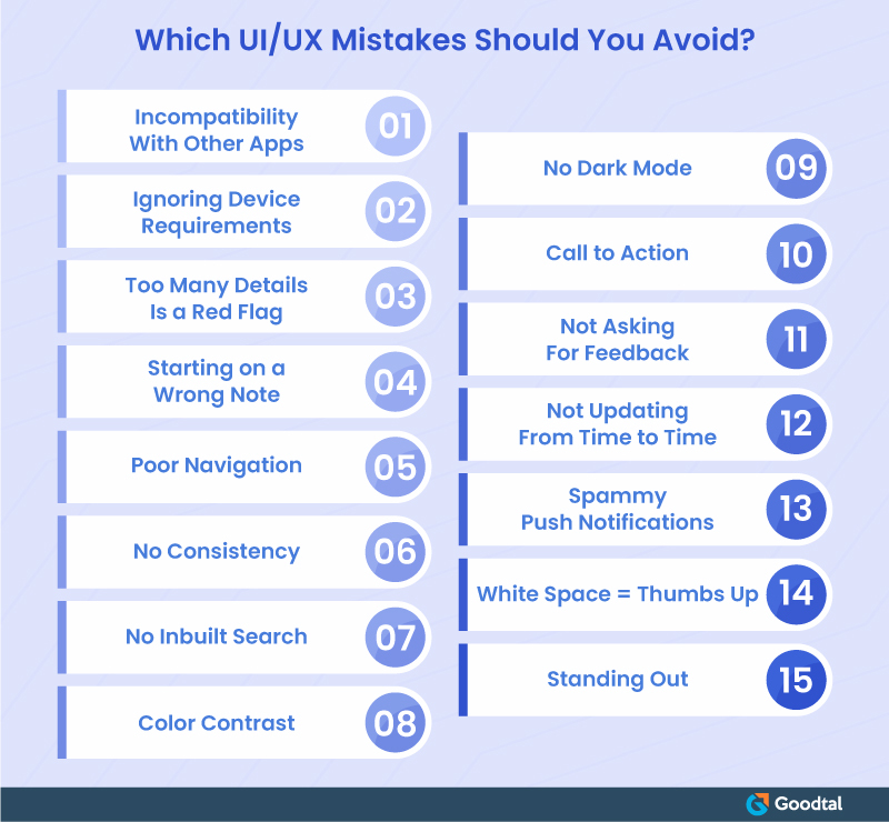
Incompatibility With Other Apps
As I mentioned above, your app will not be the only app on someone's phone. In fact, smartphones are filled up with other apps that will be used more and will never be uninstalled from their phones. Hence, the developer must make an app that is compatible with other apps as well. It should be accurately responsive to have similar experiences on different screen sizes, or else you might overlook some memory usage issues or experience unexpected crashes.
Ignoring Device Requirements
The app should work fine over various devices because not everyone will have iPhone or Android phones. It is necessary that you must not ignore the native features of the device. If that happens, you'll end up with poor UX design. It will lead the user not to use all the elements, and he will end up uninstalling the app. Hence, this is one UI/UX mistake that mobile app developers should definitely avoid making.
Too Many Details Is a Red Flag
Adding too many features that the user is confused about is a huge red flag. He will not be able to navigate through each of those and will become frustrated. Thus, adding too many details to the app could be as harmful as possible. So, the developers must take into consideration adding details to the app for a business because it could make or break the game. This UI/UX mistake should be under the not-to-do list. This is how UI/UX designers can perfect the development of an app.
Starting on a Wrong Note
Everyone is aware of the famous saying, "First impression is last impression," which might not be valid in most cases these days because the world is changing; however, it is correct with mobile app development. There will be users downloading such an app for the first time who might not know how to utilize it. Hence, for the first good impression, it becomes inevitable for the UX designer to make the application look attractive should make users curious about all the features. The UX designer must teach the user to use the app and inform him about all the elements rather than complicating it even more because no one likes apps that are confusing immediately after downloading it.
Poor Navigation
The app architecture matters as much as its appearance. While developing the app, the designer may think it is easier for him to operate the app; however, the same cannot be the case for everyone. Not everyone is a developer or tech-savvy person who can easily navigate the app. Thus, the developer must give a user manual to the users for them to navigate the app smoothly. He must keep in mind the industry requirement as well as consumers' desires while making the process flow smoothly. Or he can always create an app that is easy to understand without seeking any outside or user-manual help.
No Consistency
The icon of an app or all the features plays a crucial role in UI/UX design. These tiny symbols in the app are incredible in expressing the meaning of your application or organization. For example, if it is a fashion app, then the icon of shoes or apparel works better than the names. The UI/UX designers often use complex or unimpressive icons, which lead to an unpleasant user experience. Avoiding custom icons can be your worst UI/UX design mistake that, believe us, you do not want to make. No one likes the app with inconsistency.
No Inbuilt Search
One of the most extensive UI/UX design mistakes that a mobile app developer can make is not incorporating the search icon. Even if you might not have enough content for your app, it is necessary to put a search bar and icon that is clearly visible because you do not know who might download your app. Also, the purpose of downloading an app for people can vary. During tough times, a search bar can come in handy for people who directly want to jump to landing pages rather than navigating their way to them.
Color Contrast
Sometimes, to be creative, UI/UX developers make the mistake of choosing colors that are not appealing to users. The app is about the representation of the brand. If you fail to show what the brand is about by choosing the wrong colors and making it unappealing, it will affect the brand adversely. Hence, if the product/service you are selling is for kids, colors should be chosen likewise, and if it is for books, it should be selected accordingly.
No Dark Mode
Dark Mode is a hot favorite amongst people these days, and everyone who likes technology wishes to make the most of it. Hence, to operate the app in dark, dark mode is mandatory. This is one mistake UI/UX designers cannot afford to make ever.
Call to Action
The call-to-action button will bring users to buy the product/service from the brand. If the call to action button like,”to purchase…" or "to buy more," or "add to cart and check out" is not practical, then the user will be confused about how to use the app. If your brand has a brick-and-mortar store, the customer should feel like he is shopping from that – the process should be smooth and hassle-free.
Not Asking For Feedback
It is always said that healthy criticism is helpful for our betterment. If you ask the customers/users for feedback on a regular basis, you might learn what you couldn't have imagined. Similarly, user feedback can tell you a lot about problems they are facing to the solutions they need. Not asking for feedback would be a grave UI/UX design mistake. In fact, asking for feedback from time to time will allow you to upgrade the app and make it more user-friendly.
Not Updating From Time to Time
Upgrading the app time and again will let users enjoy more benefits. As mentioned above, not asking for feedback could be fatal for the business. Because the moment you stop asking for reviews from people will be the moment you write your deterioration. Give people what they want. Hence, updating the app from time to time will make users enjoy the app and its features. It is mandatory to read all the little pieces of advice and various tips available on the internet. It will help you broaden your knowledge and be sure about what you need to avoid.
Spammy Push Notifications
No one likes being disturbed again and again with spam push notifications. Let us be honest that getting too many notifications could be annoying. And some are stubborn that they wouldn’t go away. Yes, reaching out to the user via notifications regarding new feature updates or subscriptions is necessary. Still, it is a must to nullify the option of spamming for your users as well. It is essential to strike the correct balance between being pushy about the notifications and maintaining your presence via updates. The UI/UX designer should focus on critical and relevant information than the spammy notifications.
White Space = Thumbs Up
Filling the app with colors and content can do more harm than benefit. White space gives out the vibe of simplicity. There should be a proper balance between the text and white space in the application design. The mistake of filling up the app could prove dangerous for UI/UX designers. It becomes crucial to have breathing space within the app for proper understanding. Using up all the area may make you lose users in large quantities because people are more receptive to clean apps.
Standing Out
In order to stand out with the theme, features, and appearance of the app, the designers make the app so complex that it turns out to be confusing and messy. If the user thinks that there is lots of information up for grabs, he will leave the app and go somewhere else where he is not confused and baffled. Also, it is the designer's job to decide which UI elements they want to prioritize and make them notable. Less invasive UI solutions should present less critical information. This will help users navigate easily throughout the app.
Wrapping Up
Now you know what you should do to avoid creating a disaster for your brand by creating an inconvenient and useless mobile app. You must hire the experts who know what to do and what shouldn't be done to keep the brand floating in the market instead of drowning it. Also, here is the list of other services you can check out for your business to become digitally solid and sturdy.

Myra Williams
Content creatorMyra Williams is a content creator for more than 7 years. She loves to read and write digital articles. When she is not writing, she reads classic literature, enjoys coffee and spends time with her family.