
Today websites have become one of the most important forms of deriving information, be it for gaining educational information, news, booking tickets, filling forms, or ordering services from business websites. With the help of the top web designers, anyone today can get beautiful websites designed and running in a go.
The number of websites around the world is about to reach 1.99 billion. With the presence of such a massive number of websites, the competition has become more challenging. For a new or any website to succeed, it must have a robust web design.
There are many factors that contribute to creating a flawless, user-friendly, and beautiful website. Responsiveness of a website is one of the most trivial factors that contribute highly to the user-friendliness of a web design. Based on these factors, the type of web design is divided into two types: responsive and non-responsive design.
In this post, we'll discuss these two web design types. We'll focus on understanding why it's advisable to have a responsive web design today and discuss some of its significant benefits.
What Is a Non-responsive Web Design?
Non-responsive web designs were prevalent a few years ago; every other traditional website had a non-responsive design. This was the time when smartphones and tablets were not quite widespread. Today non-responsive web design is becoming outdated with time due to some serious limitations they possess.
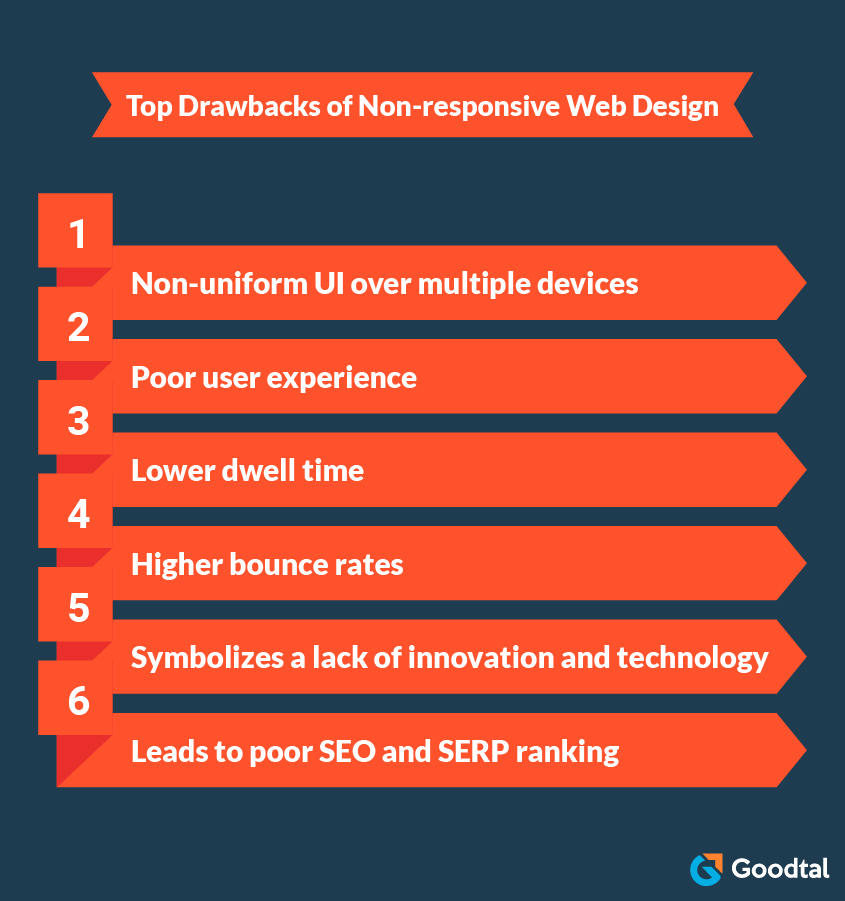
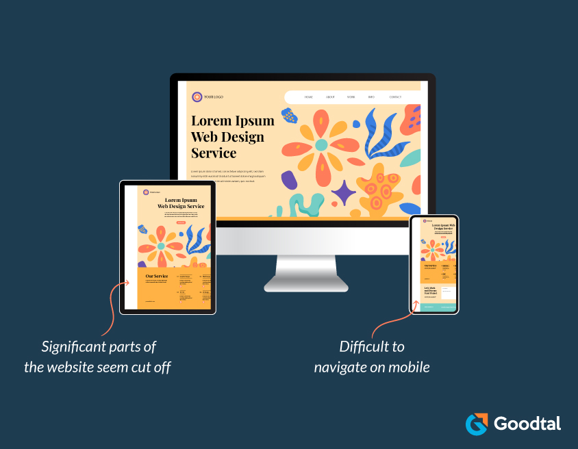
These websites do not appear the same on every interface; for example, certain parts of the same website might not appear clearly or seem cut out when opened on smartphones or tablets. This situation complicates deriving information from non-responsive websites on smartphones, thus severely affecting the website accessibility for visitors.
Non-responsive websites affect user experience by making it uncomfortable for visitors to access the website. This also showcases how the website lacks innovation and the use of new technologies. The user interface is a crucial parameter on which visitor dwell time highly depends. Non-responsive web designs have been witnessed to have poor usability on smartphones and tablets, thus forcing people to either leave the website or reduce dwell time.
From the SEO perspective, search engines like Google rank websites based on specific parameters such as quality, ease of use, and user experience. Non-responsive websites fail to suffice these parameters, thus leading to poor ranking on search engines and reduced visibility.
Non-responsive web design
What Is a Responsive Web Design?
Responsive web design is one in which the website adapts to any screen it's browsed in and appears the same no matter the device's size, be it a desktop, smartphone, TV, or tablet. The page is designed to adjust its content's width, height, and font size based on the device's screen size. This is why some websites look the same no matter the device it's opened in.
Goodtal, GoodFirms, Slack, GitHub, and Dropbox are some of the best examples of websites with responsive design.

Responsive web design
Let's move further and discuss in detail the top benefits for businesses opting for responsive web design.
Why Having a Responsive Web Design Is Beneficial for Your Business
Responsive web designs have become one of the quality symbols for websites these days that highly affect the user experience, dwell time and sales of businesses.
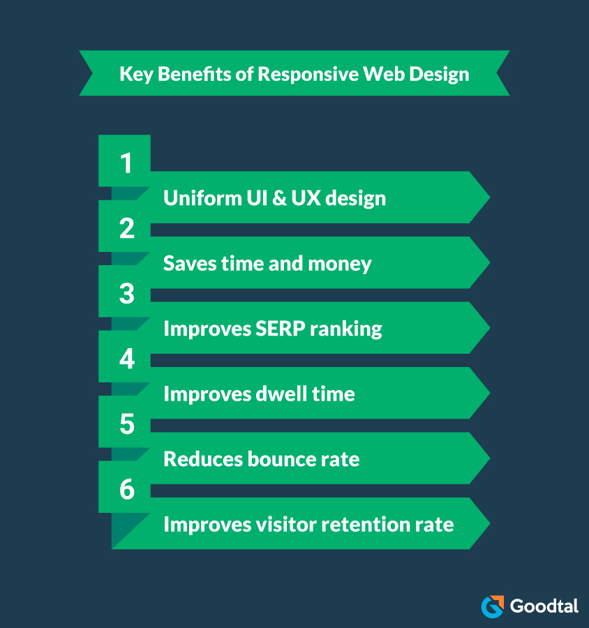
#1 Enhances Uniformity Over Multiple Devices
As already mentioned, responsive web design makes the website look and function the same, irrespective of the device in which it is being browsed. This functionality thus boosts the uniformity of the website over various devices, making it easier for users to adapt.
You must have encountered some websites requiring heavy scrolling from left to right and vice versa to access or view every page's content. It becomes very boring and uneasy to stay on such a website, especially when reading news or any such content. But this is not the case with responsive websites; these websites offer fluidity, making the content easily flow by just scrolling through the smartphone, eliminating unnecessary zoom-in and out and other such gestures.
#2 Saves Considerable Time and Costs
Sometimes web designers opt to create different web designs for the same website to run effortlessly on different devices, such as desktops, smartphones, and tablets. But this practice is very time-consuming as well as not budget-friendly, hence making the whole approach of designing non-responsive websites for multiple devices unproductive and inefficient.
A responsive website needs to be designed only once and can be deployed over multiple devices to provide the same look and feel on each of them. This saves considerable time and effort for the designers, thus allowing them to focus on other trivial matters of the business.
Hence responsive web design is the best, most-effective option that remains with designers looking forward to designing a website that flows fluidically and gives a similar look and feels on every screen size and device.
#3 Better SEO Ranking
SEO ranking is one of the most critical parameters contributing significantly to your website's success and the lead it attracts. This is the parameter based on which a website's position on search engines is decided. According to Google, responsive design is one of the essential parameters they look for in a website, along with other factors.
Most search engines like Google are opting for a "mobile first" policy which prioritizes designing any website, keeping in mind its utility and performance on smartphones. Hence from an SEO perspective, responsive web design is beneficial for websites as it helps businesses bring in more leads and improve potential lead conversions. So, those not opting for responsive web designs are losing the race to reach the top of search engines with better SEO rankings.
Suggested Reading: Digital Marketing Tips for Successful Business Website
#4 Higher Dwell Time
Dwell time again is one of the very crucial factors that affect SEO and SERP ranking. Dwell time is the total time that a person spends on a website. Suppose a website's content and the user interface are good, and the user finds it beneficial. In that case, they will likely spend a considerable time on the website deriving information. This will lead to higher dwell time which will act as an indicator for the search engines that your website speaks quality and value.
After all the points we have discussed above, responsive web design should be the first step your web designers need to take to increase the average dwell time of your website. Sometimes even with great content due to the user interface of your website over various devices, a website fails to achieve better dwell time. But opting for a responsive web design can help you in solving this problem to a significant extent.
Suggested Reading: 7 Visual Elements That Make A Perfect Web Design
#5 Helps Boost User Retentivity Rate
Attracting an audience is much simpler than making them stay and turning them into regular visitors. Non-responsive websites might attract an audience, but in this fast-moving world, it isn't easy to expect visitors to stay for a longer time. These websites are slower and, at the same time, sluggish, thus affecting the time it takes the user to gather what they need from the website.
Such scenarios force visitors to opt for other responsive websites that offer quick support, information, or services in much less time than non-responsive ones. In research by GoodFirms, it was found that lack of responsiveness or non-responsive web designs are the key reasons why visitors leave websites, according to 73.1% of surveyed web designers and web design companies.
In order to ensure that the same doesn't happen with your website, it is advisable to invest in responsive web designs which bring a fluidic user interface for its visitors on every screen they want to browse the website in.
#6 Lower Bounce Rates
Bounce rate refers to the percentage of visitors that leave your website just after visiting the first page, without going through other pages of the site. When a visitor visits a website for the first time, they will continue following the entire content of that page and visit other pages of the same site only when they can easily navigate through it and find web design satisfying. This crucial parameter contributes highly to a business website's SEO goals and SERP ranking.
It’s advisable for web designers to adopt responsive web design in order to create a website that provides the best user experience and makes the visitors revisit the site again and again. As we know, responsive web designs, compared to other web designs, provide uniform UI & UX over multiple devices by allowing users to glide through the website and services they offer quickly. Responsive design has been witnessed to reduce website bounce rates by a significant extent.
Wrapping Up
Today almost every business has a website of its own, creating more competition and forcing web designers to design a website that stands out from others and provides impeccable performance. Opting for a responsive web design is the most advisable and profitable practice web designers should do to ensure they provide the best user experience to visitors on every device and screen size.
I hope readers now understand the importance of responsive web design and how it can profit businesses. In this post, we briefly looked at non-responsive and responsive web designs. We also discussed the top benefits of responsive design that help websites attract more visitors and better positioning on search engines.

Shaun Williams
Content WriterShaun Williams is a content writer with Goodtal, a research platform for App development, Ecommerce companies, and Blockchain development services, among many others. He enjoys communicating ideas and knowledge creatively and ensuring that the readers never suffer from boredom while reading his posts.